
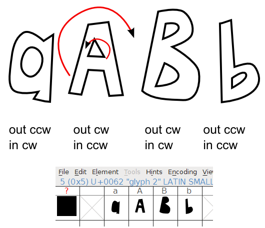
I know I read about this in the FontForge tutorial, but I cannot remember or find where. You should be careful with the direction of your paths when designing them. Here I have tested with different glyphs having outer and inner paths. Under each path I have written which direction the outer and inner paths have. For the capital A (which have the correct directions) I have also marked them with red arrows to better visualize what I am trying to say.

All the other glyphs end up with black holes when I opened the .svg in FontForge. If I tried to generate the font and install it the holes seemed to be correct, though, but I’d recommend to use the preferred directions, just in case.
Path – > Reverse help you change the directions.
You can use arrows as start/end markers on the strokes to visualize the directions or you can use the extension Visualize Path -> Number nodes.